- Organize data in Excel.
- Define class intervals based on data range and distribution.
- Calculate absolute and cumulative frequencies.
- Convert absolute frequencies to relative frequencies by dividing by total data points.
- Adjust bar heights in the histogram to represent relative frequencies.
Data Unraveled: A Journey to Understanding Relative Frequency Histograms
In today’s data-driven world, data analysis has become an indispensable tool for informed decision-making. It involves the meticulous examination of data to extract meaningful insights, identify patterns, and make predictions. One valuable technique in this analytical arsenal is the relative frequency histogram, a powerful tool for visualizing and interpreting data.
Relative frequency histograms are graphical representations that depict the distribution of data points within specific intervals. By dividing the data into meaningful categories, these histograms provide a concise and intuitive way to visualize the probability or proportion of data points falling within each interval, offering invaluable insights into the underlying data characteristics.
The process of creating a relative frequency histogram involves several key steps. First, the data is divided into class intervals, which are discrete ranges of values. The selection of appropriate class intervals is crucial to ensure accurate and insightful results. Factors to consider include the range of the data, its distribution, and the number of desired intervals.
Next, the frequency of data points within each interval is calculated. This can be expressed as either absolute frequency, indicating the raw count of data points, or cumulative frequency, which represents the total number of data points up to and including a particular interval. The cumulative frequency helps identify the proportion of data points below or above certain values.
Relative frequency is the probability or proportion of data points falling within a specific interval, calculated by dividing the absolute frequency by the total number of data points. By expressing frequencies as relative values, we can compare the distributions of different data sets with varying numbers of data points.
Finally, a histogram is constructed, where the horizontal axis represents the class intervals, and the vertical axis represents the relative frequencies. The height of each bar in the histogram corresponds to the relative frequency of the corresponding class interval. This visual representation allows for easy identification of patterns, trends, and outliers.
Relative frequency histograms have wide applications across various fields. For instance, in healthcare, they can visualize the distribution of patient ages for a particular disease, providing insights into the most prevalent age group affected. In finance, histograms can depict the frequency of stock prices, enabling analysts to assess market volatility and risk.
In summary, relative frequency histograms are a valuable tool for exploring data, identifying trends, and making informed decisions. By visualizing the distribution of data points within specific intervals, they provide a clear and concise representation of data characteristics, empowering us to extract meaningful insights from the vast ocean of data that surrounds us.
Understanding Data Sets: The Foundation of Data Analysis
Data analysis empowers us to make informed decisions by uncovering patterns and insights from raw data. At the heart of data analysis lies the concept of a data set, a collection of related data points.
A data set is composed of data, which are individual pieces of information. These data points are organized into variables, characteristics that describe different attributes of the data. Each variable can have multiple observations, different values that represent the specific instances of that variable. For example, in a data set about student test scores, the variable “Student” would represent the individual students, and the observation for each student would be their test score.
Data sets can be classified into two main types: qualitative and quantitative. Qualitative data describes non-numerical characteristics, such as gender (male/female) or occupation (doctor/teacher). Quantitative data, on the other hand, represents numerical values, such as age or weight. Quantitative data can be further categorized into numeric data, which can be expressed as numbers (e.g., height in inches), and categorical data, which can be divided into distinct categories (e.g., blood type A/B/AB/O).
Understanding the type and structure of your data set is crucial for choosing appropriate analysis techniques. By thoroughly exploring your data, you can ensure that you’re extracting the most valuable insights and making informed decisions based on solid evidence.
Defining Meaningful Class Intervals
In the realm of data analysis, effectively organizing data is crucial for drawing insightful conclusions. Dividing data into meaningful intervals, a process known as class interval determination, plays a pivotal role in this endeavor.
Class intervals are the building blocks of histograms, a graphical representation of data distribution. Each interval represents a range of values, with the data within an interval grouped together.
Components of Class Intervals
At the heart of class intervals lie interval boundaries. These are the values that determine the starting and ending points of each interval. The distance between interval boundaries defines the class width.
Another key component is the bin, which refers to each individual interval. Bins provide a visual representation of the data’s distribution, with their height corresponding to the frequency of data points within the interval.
Factors Guiding Class Interval Determination
Determining effective class intervals requires careful consideration of several factors:
-
Data Range: The spread between the minimum and maximum values of the data dictates the overall range of the intervals.
-
Data Distribution: The distribution of data points can influence the width of the intervals. For example, a highly skewed distribution may warrant intervals with varying widths to capture the full spread of data.
-
Number of Intervals: A balance must be struck between having too few and too many intervals. Too few intervals may conceal important details, while too many can make the histogram difficult to interpret.
Significance of Class Intervals
Well-defined class intervals provide a foundation for meaningful data analysis. They allow for:
- Accurate calculation of frequency distributions
- Construction of reliable histograms
- Effective comparison of data sets
- Identification of trends and patterns
By dividing data into meaningful intervals, analysts can unlock the full potential of data to gain valuable insights and inform decision-making.
Delving into the World of Frequency: Absolute, Cumulative, and Their Interplay
In the realm of data analysis, understanding the concept of frequency is paramount. Frequency provides valuable insights into how often data points occur within a given dataset. Two essential types of frequency commonly used are absolute frequency and cumulative frequency.
Absolute frequency represents the direct count of data points within a specific interval. To determine the absolute frequency of a particular interval, simply calculate the number of data points that fall within that range. For instance, in a dataset of test scores, the absolute frequency of scores between 80 and 90 would be the count of all test scores that lie within this range.
Cumulative frequency, on the other hand, refers to the total number of data points that are at or below a given interval. This measure is calculated by adding up the absolute frequencies of all intervals up to and including the interval in question. For example, the cumulative frequency of scores at or below 90 in the test score dataset would be the sum of absolute frequencies for intervals between 0 and 90.
Absolute frequency and cumulative frequency are closely related. Cumulative frequency can be obtained by adding absolute frequencies sequentially. Moreover, cumulative frequency provides a running total of data points, making it useful for identifying trends and patterns in data distribution.
Understanding Relative Frequency
In the realm of data analysis, relative frequency reigns supreme as a crucial metric for deciphering the distribution of data. It unveils the probability or proportion of data points that reside within a specific interval.
Imagine you have a dataset containing the ages of students in a classroom. To understand the distribution of ages, we can divide the data into intervals, such as 5-10 years, 11-15 years, and so on. The absolute frequency of each interval tells us the number of students within that range.
However, absolute frequency alone doesn’t provide a complete picture. To compare intervals with different numbers of data points, we need a measure that standardizes the counts. Enter relative frequency.
Calculating Relative Frequency
The formula for calculating relative frequency is as follows:
Relative Frequency = Absolute Frequency / Total Number of Data Points
For instance, if an interval has an absolute frequency of 10 and the total number of data points is 50, the relative frequency would be 10/50, or 0.2. This means that 20% of the data points fall within that particular interval.
Significance of Relative Frequency
Relative frequency is an invaluable tool in data analysis because it:
- Facilitates comparisons: It allows us to compare the distribution of data across different intervals, regardless of the number of data points in each interval.
- Reveals patterns: Relative frequency histograms (which we’ll explore later) enable us to visualize the distribution of data and identify patterns, trends, and outliers.
- Improves decision-making: By understanding the relative frequency of different intervals, we can make more informed decisions based on the likelihood of certain outcomes.
Constructing a Histogram
- Explain what a histogram is and its role in data visualization
- Describe the components of a histogram (class intervals, heights representing frequencies)
- Discuss different types of histograms (e.g., frequency histograms, probability density histograms)
Constructing a Histogram: A Visual Representation of Data
When it comes to understanding data, visualization plays a crucial role. Histograms are one of the most effective graphical tools for visualizing data distributions. They transform numerical data into a visual format, making it easier to identify patterns, trends, and outliers.
What is a Histogram?
A histogram is a type of bar chart that displays the frequency of data within specified class intervals. The x-axis of a histogram represents the class intervals, which divide the data range into meaningful segments. The y-axis represents the frequency of data points that fall within each class interval.
Components of a Histogram
- Class Intervals: These are the segments into which the data range is divided. Each class interval is represented by a bar on the histogram.
- Heights: The height of each bar corresponds to the number of data points that fall within the corresponding class interval.
- Frequency: This refers to the number of data points that fall within a specific class interval.
Types of Histograms
There are two main types of histograms:
- Frequency Histograms: These histograms display the absolute frequency of data points within each class interval.
- Probability Density Histograms: These histograms display the relative frequency of data points within each class interval. The y-axis represents the probability of finding a data point within the given class interval.
By visually representing data distributions, histograms provide valuable insights into the underlying characteristics of data. They enable analysts to identify patterns, such as central tendencies, skewness, and the presence of outliers. By understanding these characteristics, researchers can make informed decisions and draw meaningful conclusions from their data.
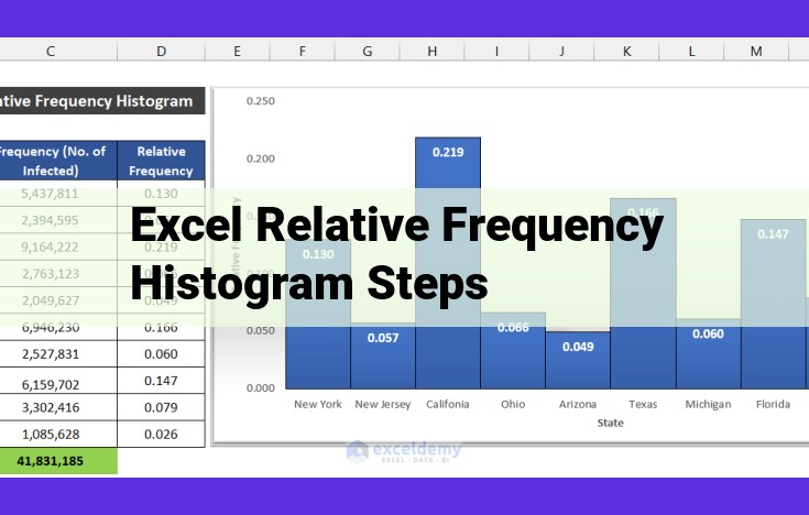
Steps to Generate a Relative Frequency Histogram in Excel: A Comprehensive Guide
In the world of data analysis, relative frequency histograms are powerful tools for visualizing the distribution of data. They provide a clear representation of the probability or proportion of data points within specific intervals. To create a relative frequency histogram in Excel, follow these comprehensive steps:
Step 1: Organize Your Data
Arrange your data in a column or row, making sure it is in ascending or descending order. This organization ensures that the histogram accurately reflects the data distribution.
Step 2: Create Class Intervals
Divide your data into meaningful intervals or bins. Determine the range of your data (highest value – lowest value) and divide it into appropriate intervals. The number of intervals depends on the data distribution, but a common rule of thumb is the Sturges’ Rule: number of intervals = 1 + 3.22 * log(n), where n is the number of data points.
Step 3: Calculate Frequency
Determine the absolute frequency of each class interval, which represents the number of data points within that interval. Additionally, calculate the cumulative frequency, which represents the total number of data points up to and including that interval.
Step 4: Calculate Relative Frequency
For each class interval, calculate the relative frequency by dividing the absolute frequency by the total number of data points. This value represents the probability or proportion of data points within that interval.
Step 5: Create a Histogram
Using a bar chart in Excel, create a histogram with the class intervals on the x-axis and the relative frequencies on the y-axis. The height of each bar represents the relative frequency of the corresponding class interval.
Step 6: Adjust Bar Heights for Relative Frequencies
To display the relative frequencies accurately, adjust the bar heights to correspond to the calculated relative frequencies rather than the absolute frequencies. This will ensure that the histogram accurately reflects the probability distribution of the data.
Creating a relative frequency histogram in Excel is a straightforward process that empowers data analysts with a powerful tool for visualizing data distribution. By following these steps, you can effectively represent the probability or proportion of data points within specific intervals and gain valuable insights from your data.