Japanese typography harmoniously blends three scripts: hiragana and katakana, phonetic representations of native and foreign words, and kanji, ideographic characters adopted from Chinese that express concepts and ideas. This tripartite system reflects the intricacies of Japanese language, where words convey not just sounds but also profound meanings. Calligraphy, a handwritten art form, adds an expressive dimension, while digital fonts specifically designed for kanji ensure legibility and visual appeal in the digital realm. The Japanese writing system is a tapestry of visual distinctiveness, showcasing the interplay between language, typography, and artistic expression.
The Enchanting Symphony of Japanese Typography: A Harmonious Trio
Imagine a symphony where three distinct melodies intertwine, each playing its unique role. That’s the captivating world of Japanese typography, where the scripts of hiragana, katakana, and kanji join in a harmonious dance.
The fusion of these three scripts creates a rich tapestry of visual distinction, reflecting the nuances and depth of the Japanese language. Hiragana and katakana are phonetic scripts, each representing a syllable of the spoken word. Hiragana is used primarily for native Japanese words, while katakana is reserved for foreign terms, onomatopoeia, and emphasis.
The third element of this typographic symphony is kanji, a collection of characters adopted from Chinese. These ideograms possess the power to convey entire concepts and ideas, often carrying a profound cultural and historical significance. The interplay between the phonetic and ideographic scripts allows for a level of expression and depth that is simply not possible with a single script.
Deciphering the Phonetic Scripts: Hiragana and Katakana
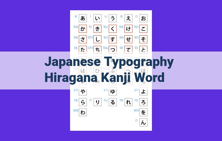
In the intricate tapestry of Japanese typography, hiragana and katakana stand out as the phonetic pillars, providing a foundation for native Japanese words and foreign terms alike. These syllabaries, composed of 46 characters each, offer a simplified gateway into the enigmatic world of Japanese writing.
Unlike the ideographic kanji, which carry complex meanings and ideas, hiragana and katakana represent the individual sounds of the Japanese language. Hiragana, with its flowing cursive strokes, is primarily used for native Japanese words, such as the poetic word sakura (cherry blossom) or the descriptive phrase tsuki ga kirei (the moon is beautiful). Its elegant strokes lend a lyrical touch to the written language.
Katakana, on the other hand, is characterized by its angular, blocky form. It is reserved for foreign words, such as kompyuta (computer) and arubaito (part-time job). These borrowings from other languages have been seamlessly integrated into the Japanese lexicon, adding a touch of globalism to the script.
The distinction between hiragana and katakana extends beyond their usage. Hiragana is often employed for grammatical functions, such as particle markers and verb conjugations. Its softer, more cursive nature complements the expressive qualities of kanji, adding nuance and context to the written word.
In contrast, katakana’s angularity makes it well-suited for emphasis and technical terms. It is often used in headlines, brand names, and scientific contexts. Its bold presence demands attention, conveying a sense of urgency or importance.
Together, hiragana and katakana form an indispensable duo, unlocking the phonetic fabric of the Japanese language. Their harmonious interplay with kanji creates a rich and versatile writing system, capable of expressing both the subtle nuances and the profound depth of Japanese thought and culture.
Unraveling the Profound Legacy of Kanji
Prologue:
Step into the enchanting realm of Japanese typography, where the written word transcends mere communication and becomes an artistic masterpiece. Among its three harmonious components, Kanji stands tall as a testament to the deep-rooted cultural exchange between East Asia.
Adoption from the East:
Kanji, meaning “Han characters,” made their way to Japan centuries ago from the vast literary tapestry of China. These intricate ideograms, unlike the phonetic scripts of hiragana and katakana, carry profound conceptual meanings that transcend spoken language.
Ideographic Essence:
The genius of kanji lies in their ideographic nature. Unlike phonetic scripts that represent sounds, kanji symbolize concepts and ideas. A single character can embody an entire word or even an abstract notion. This transformative power allows kanji to convey intricate layers of meaning with remarkable efficiency.
Conveying Concepts and Ideas:
Kanji’s ideographic essence lends itself to a profound ability to express complex concepts and abstract ideas. Through their intricate strokes and subtle nuances, kanji can convey a wealth of knowledge and wisdom that defies easy translation. They unlock a world of cultural heritage, philosophical insights, and artistic expression.
The Intertwined Dance of Language and Typography in Japanese
In the intricate tapestry of Japanese communication, language and typography intertwine like threads of a vibrant obi, seamlessly weaving together to convey not only literal meanings but also layers of cultural significance.
Words, the basic building blocks of Japanese, serve as the foundation upon which stories are told, ideas are exchanged, and emotions are expressed. They are the vessels through which the Japanese people connect, share their rich heritage, and navigate the complexities of everyday life.
Kanji: The Essence of Meaning
Among the three pillars of Japanese typography, Kanji stands tall as the embodiment of meaning. These ideographic characters, borrowed from ancient China, carry within them the weight of history, culture, and abstract concepts. Each Kanji conveys not just a phonetic value but a nuanced collection of meanings and associations.
Consider the Kanji fū (風), meaning “wind.” At a glance, it suggests a gentle breeze or a tempestuous whirlwind. Delving deeper, it evokes images of change, impermanence, and the interconnectedness of all things. In this way, Kanji transcends mere words, becoming a conduit for philosophical and cultural insights.
The Symphony of Scripts
The harmonious coexistence of hiragana and katakana with Kanji creates a rich and versatile writing system. Hiragana, with its flowing cursive strokes, lends itself to native Japanese words, expressing the细腻 nuances of emotion and the subtle turns of speech. Katakana, on the other hand, with its sharp angles and distinct forms, is used for loanwords from other languages and for emphasizing specific terms.
Together, these three scripts form a symphony of sounds and images, capturing the essence of Japanese speech and conveying the depth of its cultural heritage.
The Artistic Grace of Calligraphy: A Brushstroke Dance in Japanese Script
In the realm of Japanese typography, calligraphy emerges as an art form that transcends mere penmanship. It is a rhythmic dance of brushstrokes that transforms written characters into visually captivating expressions.
Japanese calligraphy, known as shodō, has its roots in ancient China. Over centuries, it has evolved into a highly refined and expressive art form in Japan. The calligrapher’s brush becomes an extension of their inner spirit, guiding their hand to produce fluid and dynamic strokes.
Each brushstroke carries its own significance and subtlety. The thickness, length, and direction of the stroke can convey a range of emotions and meanings. The calligrapher’s skill lies in capturing the essence of the words through their brushwork, creating a harmonious interplay between form and content.
Calligraphy transcends the boundaries of language, becoming a visual language in its own right. The graceful curves and bold strokes can evoke a range of impressions, from serenity to power. In the hands of a master calligrapher, words transform into art.
Japanese calligraphy is not merely a form of decoration; it is a highly expressive medium that allows the artist to express their personal style and inner emotions. Through the intricate dance of their brushstrokes, calligraphers create timeless and meaningful works of art.
Digital Expressions: Kanji Fonts and Their Significance
In the digital landscape, the display of Japanese characters assumes paramount importance. With the advent of digital platforms, the need for fonts that could faithfully render the nuances of kanji characters became imperative.
Kanji fonts are meticulously designed to optimize the legibility and visual appeal of kanji characters. They come in a myriad of styles, ranging from traditional to modern, and weights, from light to bold. The variations in font design serve to accommodate different contexts and aesthetic preferences.
Legibility is a crucial factor in font selection for digital displays. Well-designed kanji fonts ensure that characters are clear and easy to read, even at small sizes. The balance of stroke width, spacing, and overall shape contribute to the perceptual clarity of the font.
Furthermore, the expressive qualities of fonts play a significant role in conveying the semantics and tone of Japanese texts. For instance, a calligraphic font may evoke a sense of formality or elegance, while a modern font may convey a more contemporary and approachable tone.
The choice of font style and weight depends on the nature of the content being displayed. Formal documents, such as contracts and legal texts, may require fonts with a traditional style and heavier weight, while more casual or artistic texts may benefit from lighter weights and more expressive styles.
In the world of digital typography, kanji fonts have emerged as essential tools for effective communication. Their meticulous design and versatility empower designers and writers to create visually striking and legible texts that convey the richness and depth of the Japanese language.
Japanese Writing System: A Tapestry of Visual Distinctiveness
- Emphasize the unique character of the Japanese writing system, combining hiragana, katakana, and kanji.
- Discuss the importance of spacing, layout, and font selection for optimal legibility and aesthetic appeal.
The Japanese Writing System: A Tapestry of Visual Distinctiveness
The Japanese writing system is a captivating harmony of three distinct scripts: hiragana, katakana, and kanji. Like a symphonic orchestra, each component contributes its unique melody, weaving together a rich tapestry of visual expression.
Hiragana and Katakana: Phonetic Fusion
Hiragana and katakana are syllabaries, each representing a distinct sound. Hiragana is used for native Japanese words, while katakana is reserved for foreign terms and onomatopoeia. These phonetic scripts allow for a fluid and expressive written language.
Kanji: The Weight of History
Kanji, adopted from Chinese characters, are ideographs that convey entire concepts and ideas. Each kanji carries a profound weight of history and meaning. Their careful arrangement on the page creates a visual dance of language and thought.
Interwoven Language and Typography
Despite their distinct forms, hiragana, katakana, and kanji intertwine seamlessly in Japanese writing. Words become the foundation of communication, while typography enhances their meaning and nuance. Kanji often carry deeper connotations, informing the reader beyond the surface words.
Calligraphy’s Artistic Grace
Calligraphy, the handwritten art of Japanese script, adds a touch of elegance to the written word. Brushstrokes flow with expressive grace, creating visually stunning texts that transcend mere communication.
Digital Expressions: Kanji Fonts
In the digital age, kanji fonts have become essential for presenting Japanese text on screens. These fonts vary in style, weight, and legibility, enhancing the visual impact of digital content.
A Unique Tapestry
The Japanese writing system stands out as a singular marvel. The combination of hiragana, katakana, and kanji creates a unique tapestry of visual distinctiveness. Proper spacing, layout, and font selection are crucial for legibility and aesthetic appeal, resulting in written works that are both informative and visually captivating.